Link: http://www.powermockup.com/
Disclosure Time: I approached the developer of this app offering to do a review in exchange for a review license. This isn't the sort of thing I usually blog about (except internally, a few times, in the company I work for) but I'm all for supporting the people who deserve support and truth be told I would probably have written this blog post anyway (yep it'll be a positive one)
Happy with that? Good lets crack on.
The Past
I've written a fair number UI design documents over the last few years and for all of these I have used Balsamiq. The problem with that is our companies standard/approved wire-framing solution is Visio (with the GUUUI templates). Why did I go against the grain? Well I am not a mad fan of Visio. It's not exactly lightweight, in fact it's extremely bloated (at least in the wire-framing sense), and that is easily the worst thing you can ask for when dealing with highly iterative, dynamic, interactive wire-framing. You need to work with the Visio rather than let Visio work for you and that is slightly too much fail for me most of the time. Admittedly there has been times I prefer the slicker, more professional, output of Visio (our customers come from the stiff collar world of finance and the like so it tends to sit better with them). But were I can I stick with Balsamiq. Until now....
The Present
The problem I've always faced with Balsamiq is that when I produce a first draft of a document with, say, 20 odd wireframes in it and something fundamental is changed by the customer then I have a hard slog ahead to fix all those images. Thankfully a colleague of mine, one much better at this wire-framing/UX stuff than me, pointed me towards PowerMockup. Rather than make a new standalone application that has it's own random UI features and offers little to on integration into the app we use day today PowerMockup is simply an extension/add-on to Powerpoint. So what does this mean? Well it means,
- The devs spent more time into the templates and stuff that matter
- Fully integrated into the Office application stack (think ability to tweak results when embedded into Word)
- Already makes use of the built in “smart” styling and other features that make Powerpoint actually a fairly decent app for quick templating and stuff. In fact take it a step further and you could make use of Powerpoint's animation stuff to demonstrate UI interactions.
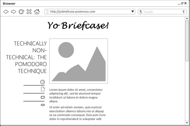
So given 5 minutes what could I do? And I do mean 5 minutes (possibly slightly less). Well I mocked up the website you are reading right now.

Trippy eh? It's not my best work (far from it) but it did help me test drive PowerMockup and get a better feel of it. So I like it. I like it because of all the things I've mentioned above (who wouldn't). I'd use it, and will use it, as my wire-framing tool of choice (and not because I got a free license - my work would pay for it anyway cause they are total aces) from now on but it's not perfect. If I had to pick holes there are a few things that I'd mention,
- My biggest peeve but it's not a show stopper is the location of the various shapes/widgets. Dropdowns are in “Navigation” and Text fields are in “Text” but 99% of the time I'd want both of those when constructing a form. I'd really like a “Form” collection with all of these things grouped.
- If I drop a browser container on the page then drop a scrollbar on the page I need to resize said scrollbar to fit the browser container. Problem is, as the scrollbar is a grouped object, it will stretch the entire thing rather than extend the base rectangle. Again no show stopper but it is a bit of a pain. I guess offering the components as separate shapes might make it easier (just a suggestion).
- There a plenty of icons but I'd like to see a few more (“comments” icon, “tags” icon) - the equivalent famfamfam icon set would blow me away (and also a lot to ask). Possibly some more mobile shapes etc. would also be nice.
The Future
So thats it for now I am very happy, not because I managed to blag a free license, but rather because the app/plugin/whatever fits into how I do things so seamlessly. Good work and I look forward to future updates - hopefully more people think the same.